
I’m curious about how impactful color psychology is in graphic design. Do you think color psychology can affect user behavior and brand perception, or is it mostly just about how things look? I would love to hear your thoughts and experiences!
I would say that’s important and I can give a (pesonal) example.
Quantum Conundrum (2012) was developed by the same person who designed Portal (2007).
So, when I heard about it, I was very interested to play it.
But this game has been the only one that make me asleep. I’m not kidding.
There are games in which, after little or a while, I’m not interested to play, but never a game have made me sleepy.
I was intrigued to find out why, and concluded that the problem was the use of the colors on the enviroment design.
If you play the game, you can see that the overall colors are dull, they are not used to separate thing (like background and interactable objects) or caught your attention (like today’s overused yellow), and this dullness somehow make the game (at least for me) very tedious to play.
I think that if the game used brightest and distinct colors and textures, it would have been more succesful.
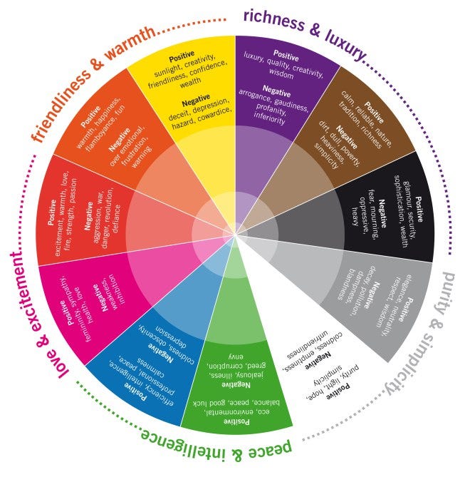
what perhaps most people agree on, or that something like the classic colors make the most sense, and when one looks at abstract paintings, or things in museums, and that’s the ’ ultimate color reference ’
here’s what certain colors do for me, and they somehow remind me of
-
blue : energy, vitality, perhaps coldness, or then ’ fervor ', and noble ambitions, or ’ to do stuff ’
-
red : usually both calm, and then the ’ color of affection ', or that perhaps because blood is red, and that somehow is connected with love, or then tender devotion
-
purple : somehow upper class, or ’ for the better people ’ that either have done very important things, or then have more qualities, and virtues than most, or what one might call elite reflections
-
green : somehow the colors of being ’ harsh ', and then much conviction, or also somehow oppressive, and even dull, or monotone, and even soulless activities
-
pink : both the color of ’ parties ', or then also business, and to exchange things, or setting a price on things
-
brown : either the color of solitude, and perhaps more quietude, or also wisdom, and that monks tend to wear this to make them look erudiate, or perhaps also scholars, and to read a ton of books
here’s what other people think that there’s a ton of theories as to what colors, and shadows, or then also lighting does to people, and how it effects ’ mood ', or also ’ decisions ', and works to inspire different people
WHAT PERHAPS MATTERS
-
colors affect almost the soul, or moves the audience quite a bit, and to think of it as a ’ gift ’ for reaching people, or also telling nice stories, and add much to the public
-
after that one could use it for rather basic manipulation, or to get what one wants from the audience, and where one could learn exploitation, or also to play on fright, and other feelings in a more seditious way
-
finally that hues have a more primitive effect, and where certain might cause, or remind of ’ luxury ', and then ’ work ', or also ’ hunger ’ for things like food, and that one could mess with the audience at that level, or try and make people buy more of this, and that product from those artistic lectures
note : perhaps find a web page with very pro artists, and then books from the more known teachers in the field to make sense of this, or could imagine books on corporate marketing really knows how to mess with people, and sort of push them around with visuals, or slogans, and they might have almost theories of how things like posters, or trailers for movies make people buy more of whatever they’re selling, etc